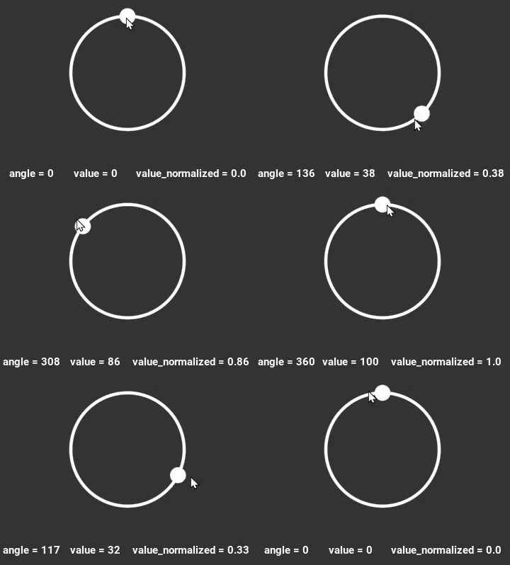
The RadialSlider is an angular slider widget, which acts similarly to
the kivy's native linear slider.
The RadialSlider has two components: a track and a thumb. The thumb → ●, can be dragged along the circular path of the track → ◯, with an angle
ranging from 0 to 360 degrees.
You can define the position of the thumb via the angle, the value, or the normalized_value.
Note that these values are also automatically updated as the thumb is dragged.
pip install kivy_garden.radialslider
from kivy_garden.radialslider import RadialSlider
The Radial Slider will adjust to the smallest size, between height and width. Setting different sizes for the width and height is not recommended, as although the visible path and thumb will adjust to the smallest size, the widget as a whole will still conform to the size you set.
While setting the size incorrectly does not compromise the functionality of the widget itself, you might be overwriting another widget's area resulting in unexpected behavior of the other widget.
The example bellow shows the difference between the unespected behavior with wrong fitting and the correct fitting. The red area shows the real widget size.
| Wrong size definition | Wrong size definition | Correct size definition |
|---|---|---|
 |
 |
 |
size_hint: (None, None) size: 250, 200 ❌ |
size_hint: (None, None) size: 200, 250 ❌ |
size_hint: (None, None) size: 200, 200 ✔️ |
If you want to set the size based on size_hint, the proper way would be:
For adjust the height to the width:
size_hint: (your_size_hint_x, None)
height: self.width
Or for adjust the width to the height:
size_hint: (None, your_size_hint_y)
width: self.height
Or just using the size property:
size_hint: (None, None)
size: your_width, your_height # one value must be the same as the other
🟡 If the parent of the RadialSlider widget has equal width and height dimensions, eg: size: (200, 200). You can use size size_hint_x and size_hint_y freely, as long as you set the same value for both, like: size_hint:(0.5, 0.5 ), size_hint:(0.2, 0.2), etc.
The RadialSlider widget provides the essential components: Thumb → ●, and Track → ◯.
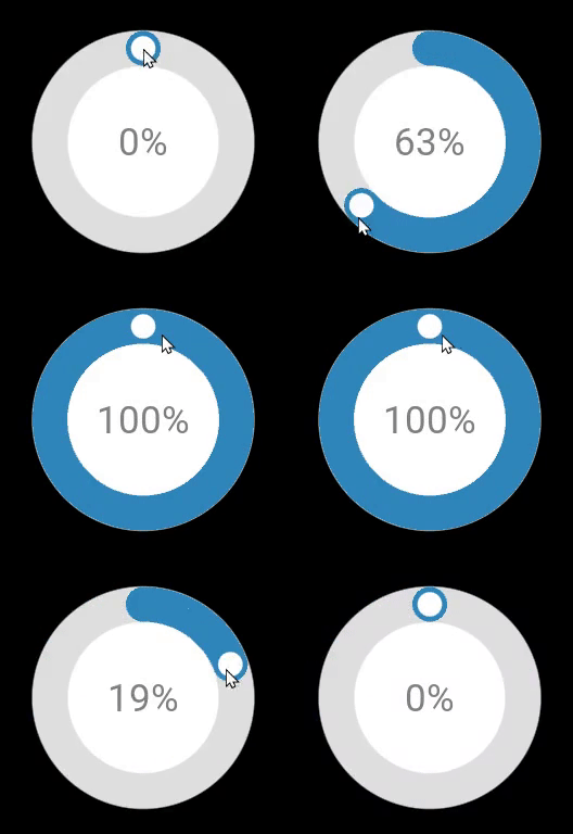
But with a few lines of code, you can change its appearance as you wish. Take a look at the example below, how easy it is.
RadialSlider:
    size_hint: (None, None)
    size: 200, 200
    track_color: "#DEDEDE" # gray track
    track_thickness: 15
    canvas.before:
        # white background
        Color:
            rgba: rgba("#FFFFFF")
        Ellipse:
            size: self.size
            pos: self.pos
    canvas:
        # blue line
        Color:
            rgba: rgba("#3086BD")
        Line:
            width: 15
            circle: self.center_x, self.center_y, self.width/2 - 15, 0, self.angle
            cap_precision: 500
    Label:
        pos: self.parent.center_x - self.width/2, self.parent.center_y - self.height/2
        text: "{}%".format(int(self.parent.value))
        color: "#808080"
font_size: dp(35)angle
Current angle used for the Radial Slider. You can use it for setting the angle of the thumb in the track in range 0 - 360.
angleis defaults to 0.
max_value
Maximum value allowed for the Radial Slider.
max_valueis defaults to 1.
min_value
Minimum value allowed for the Radial Slider.
min_valueis defaults to 0.
thumb_color
Color of the thumb.
thumb_coloris defaults to '#ffffff.'''
thumb_diameter
Diameter of the thumb.
thumb_diameteris defaults to 25.
track_color
Color of the track.
track_coloris defaults to "#ffffff".
track_thickness
Thickness of the track.
track_thicknessis defaults to 2.'''
value
Normalized value inside the range (min_value - max_value). You can use it for setting the value betwwen the minimum and maximum value.
valueis defaults to 0.
value_normalized
Normalized value inside the range (min_value - max_value) to 0-1 range. You can also use it for setting the real value without knowing the minimum and maximum value.
value_normalizedis defaults to 0
Every push or pull request run the GitHub Action CI. It tests the code on various OS and also generates wheels that can be released on PyPI upon a tag. Docs are also generated and uploaded to the repo as well as artifacts of the CI.
Check out our contribution guide and feel free to improve the RadialSlider flower.
🔴 If you have a bug or an idea, create a report to help us improve or suggest an idea for this project by opening an issue
This software is released under the terms of the MIT License. Please see the LICENSE.txt file.


