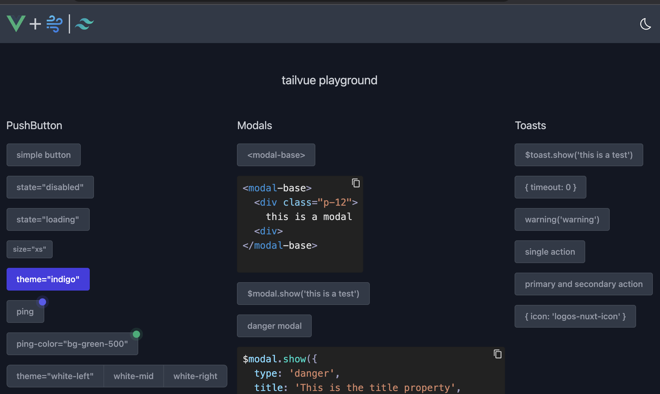
Vue components built for Vue3 powered by Uno CSS or tailwindcss
- 🌔 All components and classes include dark-mode support
- 🔌 Programmatic toasts
$toast.show('this is a test');$toast.show({
type: 'danger',
message: 'single action toast',
timeout: 6,
primary: {
label: 'UNDO',
action: () => $toast.show('you clicked UNDO')
}
})- 🔌 Programmatic modals
$modal.show({
  type: 'danger',
  title: 'This is the title property',
  body: 'This is the body property.',
  primary: {
    label: 'Primary Action',
    theme: 'red',
    action: () => $toast.show('Primary Button clicked'),
  },
  secondary: {
    label: 'Secondary Action',
    theme: 'white',
    action: () => $toast.show('Clicked Secondary'),
  },
})- 🎪 Interactive playground! - just run
yarn; yarn dev
- ✨ Tons of other components that will be documented shortly!
yarn add --dev @tailvue/nuxt- Add this to your
nuxt.config.ts
modules: [
    // ...
    '@tailvue/nuxt',
],
Note If you are using Nuxt 2 you may need to put this in of the
buildModulesarray
yarn add tailvueimport { useToast, useModal } from 'tailvue'
const $toast = useToast()
const $modal = useModal()- All Icons are brought in via the Iconify Vue Component
yarn add --dev @iconify/vue- Install UnoCSS
- No include is needed for uno, we have added @unocss/include to our generated files
- Install tailwindcss
- Add the following to your
tailwind.config.js
module.exports = {
  content: [
    ...
      "node_modules/tailvue/dist/tailvue.es.js",
  ],
}


