(Widget) Media
| Option | Type | Default | Description |
|---|---|---|---|
label |
string | "{artist}{s}{title}" |
The main label format for the media widget. |
label_alt |
string | "{title}" |
The alternative label format for the media widget. |
separator |
string | " - " |
The dynamic separator. Automatically stripped. More below. |
class_name |
string | "" |
The custom CSS class name for the widget. |
label_shadow |
boolean | false | Whether to show a shadow effect on the label. |
max_field_size |
dict | Maximum field sizes for labels. | |
max_field_size.label |
integer | 20 | Maximum size for the main label. |
max_field_size.label_alt |
integer | 30 | Maximum size for the alternative label. |
max_field_size.truncate_whole_label |
boolean | false | Whether to truncate the whole label if it exceeds the maximum size. |
show_thumbnail |
boolean | true | Whether to show the media thumbnail. |
controls_only |
boolean | false | Whether to show only the media controls. |
controls_left |
boolean | true | Whether to position the controls on the left. |
controls_hide |
boolean | false | Whether to hide the media controls buttons |
hide_empty |
boolean | true | Whether to hide the widget when there is no media information. |
thumbnail_alpha |
integer | 50 | The alpha transparency value for the thumbnail. |
thumbnail_padding |
integer | 8 | The padding around the thumbnail. |
thumbnail_corner_radius |
integer | 0 | The corner radius for the thumbnail. |
symmetric_corner_radius |
boolean | false | Whether to use symmetric corner radius for the thumbnail. |
thumbnail_edge_fade |
boolean | false | Whether to apply an edge fade effect to the thumbnail. |
icons |
dict | Icons for media controls. | |
icons.prev_track |
string | \uf048 |
Icon for the previous track button. |
icons.next_track |
string | \uf051 |
Icon for the next track button. |
icons.play |
string | \uf04b |
Icon for the play button. |
icons.pause |
string | \uf04c |
Icon for the pause button. |
animation |
dict | {'enabled': true, 'type': 'fadeInOut', 'duration': 200} |
Animation settings for the widget. |
container_shadow |
dict | See below | Container shadow options. |
label_shadow |
dict | See below | Label shadow options. |
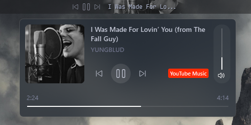
media_menu |
dict | See below | Media menu popup. |
media_menu_icons |
dict | See below | Media menu icons for popup. |
scrolling_label |
dict | See below | Widget label scrolling options |
callbacks |
dict | See below | Callbacks for mouse events on the widget. |
media:
  type: "yasb.media.MediaWidget"
  options:
    label: "{title}{s}{artist}"
    label_alt: "{title}"
    separator: " - "
    hide_empty: true
    callbacks:
      on_left: "toggle_label"
      on_middle: "do_nothing"
      on_right: "do_nothing"
    max_field_size:
      label: 20
      label_alt: 30
    show_thumbnail: true
    controls_only: false
    controls_left: true
    controls_hide: false
    thumbnail_alpha: 80
    thumbnail_padding: 8
    thumbnail_corner_radius: 16
    icons:
      prev_track: "\ue892"
      next_track: "\ue893"
      play: "\ue768"
      pause: "\ue769"
    media_menu:
      blur: false
      round_corners: true
      round_corners_type: "normal"
      border_color: "system"
      alignment: "right"
      direction: "down"
      offset_top: 6
      offset_left: 0
      thumbnail_corner_radius: 8
      thumbnail_size: 120
      max_title_size: 60
      max_artist_size: 20
      show_source: true
    media_menu_icons:
      play: "\ue768"
      pause: "\ue769"
      prev_track: "\ue892"
      next_track: "\ue893"
    scrolling_label:
      enabled: false
      update_interval_ms: 33
      style: "left"  # can be "left", "right", "bounce", "bounce-ease"
      separator: " | "
      label_padding: 0
      always_scroll: false
      # Easing curve params: https://www.desmos.com/calculator/j7eamemxzi
      ease_slope: 20
      ease_pos: 0.8
      ease_min: 0.5
    label_shadow:
      enabled: true
      color: "black"
      radius: 3
offset: [ 1, 1 ] media_menu:
blur: false # Whether to apply a blur effect to the popup background.
round_corners: true # Whether to round the corners of the popup.
round_corners_type: "normal" # The type of corner rounding. Can be "normal" or "symmetric".
border_color: "system" # The border color of the popup. Can be a HEX, None or "system".
alignment: "right" # The alignment of the popup relative to the widget. Can be "left", "center", or "right".
direction: "down" # The direction in which the popup opens. Can be "up" or "down".
offset_top: 6 # The vertical offset of the popup from the widget.
offset_left: 0 # The horizontal offset of the popup from the widget.
thumbnail_corner_radius: 8 # The corner radius for the thumbnail in the popup.
thumbnail_size: 120 # The size of the thumbnail in the popup.
max_title_size: 60 # The maximum size for the title in the popup.
max_artist_size: 20 # The maximum size for the artist name in the popup.
show_source: true # Whether to show the media source (e.g., Spotify, YouTube) in the popup.
show_volume_slider: false # Whether to show the volume slider in the popup. Volume control per application. media_menu_icons:
play: "\ue768" # Icon for the play button in the popup.
pause: "\ue769" # Icon for the pause button in the popup.
prev_track: "\ue892" # Icon for the previous track button in the popup.
next_track: "\ue893" # Icon for the next track button in the popup.
mute: "\ue994" # Icon for the mute button in the popup.
unmute: "\ue74f" # Icon for the unmute button in the popup. scrolling_label:
enabled: false # Whether to enable the scrolling label.
update_interval_ms: 33 # The update interval for the scrolling label in milliseconds.
style: "left" # The style of the scrolling label. Can be "left", "right", "bounce", or "bounce-ease".
separator: " | " # The separator between repeating text in "left" or "right" scrolling style.
label_padding: 1 # The padding around the label in "bounce" and "bounce-ease" style. By default it's one character on each side.
ease_slope: 20 # The easing slope for the bounce effect. Easing curve params: https://www.desmos.com/calculator/j7eamemxzi
ease_pos: 0.8 # The easing curve position for the bounce effect.
ease_min: 0.5 # The minimum value for the bounce effect easing curve.-
toggle_label: Toggles the visibility of the label. -
do_nothing: A placeholder callback that does nothing when triggered. -
toggle_play_pause: Toggles between play and pause states. -
toggle_media_menu: Toggles the visibility of the media menu popup.
    container_shadow:
      enabled: false          # Whether to enable the container shadow.
      color: "black"          # The color of the shadow. Can be a HEX value or color name.
      radius: 3               # The blur radius of the shadow.
      offset: [1, 1]          # The offset of the shadow in the format [x, y].

    label_shadow:
      enabled: false          # Whether to enable the label shadow.
      color: "black"          # The color of the shadow. Can be a HEX value or color name.
      radius: 3               # The blur radius of the shadow.
offset: [1, 1] # The offset of the shadow in the format [x, y].-
label: The format string for the media label. You can use placeholders like
{title}and{artist}to dynamically insert media information. - label_alt: The alternative format string for the media label. Useful for displaying additional media details.
-
separator: The dynamic separator
{s}that will be stripped from the label if it's at the end or start of the label. Useful when parts of the label are not present at the source to avoid having separator at the end/beginning of the label. - class_name: The CSS class name for the widget. This allows you to apply custom styles to the widget. (optional)
- hide_empty: Whether to hide the widget when there is no media information available.
-
callbacks: A dictionary specifying the callbacks for mouse events. The keys are
on_left,on_middle,on_right. -
max_field_size: Maximum field sizes for the labels.
- label: Maximum size for the main label. If the label exceeds this size, it will be truncated.
- label_alt: Maximum size for the alternative label. If the label exceeds this size, it will be truncated.
-
truncate_whole_label: Whether to truncate the whole label or separated
{title} {artist}if it exceeds the maximum size. If set to false, only the part that exceeds the maximum size will be truncated.
- show_thumbnail: Whether to show the media thumbnail.
- controls_only: Whether to show only the media controls.
- controls_left: Whether to place the media controls on the left.
- controls_hide: Whether to hide the media controls buttons.
- thumbnail_alpha: The alpha (transparency) value for the media thumbnail.
- thumbnail_padding: The padding around the media thumbnail.
- thumbnail_corner_radius: The corner radius for the media thumbnail. Set to 0 for square corners.
- symmetric_corner_radius: Whether to use symmetric corner radius for the thumbnail. If set to true, the corner radius will be applied equally on all corners.
- thumbnail_edge_fade: Whether to apply an edge fade effect to the thumbnail. This can create a smoother transition between the thumbnail and the background.
-
icons: Icons for the media controls.
- prev_track: Icon for the previous track button.
- next_track: Icon for the next track button.
- play: Icon for the play button.
- pause: Icon for the pause button.
-
animation: A dictionary specifying the animation settings for the widget. It contains three keys:
enabled,type, andduration. Thetypecan befadeInOutand thedurationis the animation duration in milliseconds. -
container_shadow: Container shadow options.
- enabled: Whether to enable the container shadow.
- color: The color of the shadow. Can be a HEX value or color name
- radius: The blur radius of the shadow.
- offset: The offset of the shadow in the format [x, y].
-
label_shadow: Label shadow options.
- enabled: Whether to enable the label shadow.
- color: The color of the shadow. Can be a HEX value or color name
- radius: The blur radius of the shadow.
- offset: The offset of the shadow in the format [x, y].
-
media_menu: A dictionary specifying the media menu popup options.
- blur: Whether to apply a blur effect to the popup background.
- round_corners: Whether to round the corners of the popup.
-
round_corners_type: The type of corner rounding. Can be
normalorsymmetric. -
border_color: The border color of the popup. Can be a HEX value, None, or
system. -
alignment: The alignment of the popup relative to the widget. Can be
left,center, orright. -
direction: The direction in which the popup opens. Can be
upordown. - offset_top: The vertical offset of the popup from the widget.
- offset_left: The horizontal offset of the popup from the widget.
- thumbnail_corner_radius: The corner radius for the thumbnail in the popup.
- thumbnail_size: The size of the thumbnail in the popup.
- max_title_size: The maximum size for the title in the popup.
- max_artist_size: The maximum size for the artist name in the popup.
- show_source: Whether to show the media source (e.g., Spotify, FireFox) in the popup.
- show_volume_slider: Whether to show the volume slider in the popup. Volume control per application.
-
media_menu_icons: A dictionary specifying the icons for the media menu popup. It contains
- play: Icon for the play button in the popup.
- pause: Icon for the pause button in the popup.
- prev_track: Icon for the previous track button in the popup.
- next_track: Icon for the next track button in the popup.
- mute: Icon for the mute button in the popup.
- unmute: Icon for the unmute button in the popup.
-
scrolling_label: A dictionary specifying the scrolling label options for the widget.
- enabled: Whether to enable the scrolling label.
- update_interval_ms: The update interval for the scrolling label in milliseconds. Min 4 max 1000.
-
style: The style of the scrolling label. Can be
left,right,bounce, orbounce-ease. -
separator: The separator between repeating text in
leftorrigntscrolling style. -
label_padding: The padding around the label in
bounceandbounce-easestyle. By default it's one character on each side. -
always_scroll: Whether to always scroll the label regardless of the text length in
leftorrightstyle. - ease_slope: The easing slope for the bounce effect. Easing curve params: https://www.desmos.com/calculator/j7eamemxzi
- ease_pos: The easing curve position for the bounce effect.
- ease_min: The minimum value for the bounce effect easing curve.
- The scrolling label uses
max_field_sizeto limit its size. - The scrolling label will disable
thumbnail_paddingoption and.media-widget .label { margin: ... }should be used instead.
.media-widget {}
.media-widget .widget-container {}
.media-widget .label {}
.media-widget .label.alt {}
.media-widget .btn.play {}
.media-widget .btn.prev {}
.media-widget .btn.next {}
.media-widget .btn.disabled {}

.media-menu {}
.media-menu .title {}
.media-menu .artist {}
.media-menu .source {}
.media-menu .btn.play {}
.media-menu .btn.pause {}
.media-menu .btn.prev {}
.media-menu .btn.next {}
.media-menu .btn.disabled {}
.media-menu .thumbnail {}
.media-menu .playback-time {}
.media-menu .progress-slider {}
.media-menu .progress-slider::groove {}
.media-menu .progress-slider::sub-page {}
.media-menu .progress-slider::handle {}
.media-menu .progress-slider::handle:hover {}
.media-menu .app-volume-container {}

.media-menu .app-volume-container .volume-slider {}
.media-menu .app-volume-container .volume-slider::groove {}
.media-menu .app-volume-container .volume-slider::sub-page {}
.media-menu .app-volume-container .volume-slider::handle {}
.media-menu .app-volume-container .volume-slider::handle:hover {}
.media-menu .app-volume-container .mute-button {}.media-widget {
padding: 0;
margin: 0;
}
.media-widget .label {
color: #d2d6e2;
padding: 0px;
padding-right: 4px;
font-size: 12px;
}
.media-widget .btn {
color: #9498a8;
padding: 0 4px;
margin: 0;
font-family: "Segoe Fluent Icons";
font-weight: 400;
}
.media-widget .btn:hover {
color: #babfd3;
}
.media-widget .btn.play {
font-size: 16px;
}
.media-widget .btn.disabled:hover,
.media-widget .btn.disabled {
color: #4e525c;
font-size: 12px;
background-color: rgba(0, 0, 0, 0);
}.media-menu {
min-width: 440px;
max-width: 440px;
background-color: rgba(31, 39, 49, 0.5);
}
.media-menu .title,
.media-menu .artist,
.media-menu .source {
font-size: 14px;
font-weight: 600;
margin-left: 10px;
font-family: 'Segoe UI';
}
.media-menu .artist {
font-size: 13px;
color: #6c7086;
margin-top: 0px;
}
.media-menu .source {
font-size: 11px;
color: #000;
border-radius: 3px;
background-color: #bac2de;
padding: 2px 4px;
font-weight: 600;
font-family: 'Segoe UI';
margin-top: 10px;
}
/* The source class name is the same as what you see in the media widget; just replace spaces with dashes and convert it to lowercase.
Example: "Windows Media" becomes "windows-media" */
.media-menu .source.aimp {
background-color: #6f42c1;
color: #ffffff;
}
.media-menu .source.apple-music {
background-color: #fa2b56;
color: #ffffff;
}
.media-menu .source.brave {
background-color: #fb542b;
color: #ffffff;
}
.media-menu .source.chrome {
background-color: #4285f4;
color: #ffffff;
}
.media-menu .source.edge {
background-color: #0078d4;
color: #ffffff;
}
.media-menu .source.firefox {
background-color: #ff7139;
color: #ffffff;
}
.media-menu .source.foobar2000 {
background-color: #444444;
color: #ffffff;
}
.media-menu .source.media-player {
background-color: #0078d4;
color: #ffffff;
}
.media-menu .source.murglar {
background-color: #8a8a8a;
color: #ffffff;
}
.media-menu .source.musicbee {
background-color: #ffcc00;
color: #000000;
}
.media-menu .source.nsmusics {
background-color: #e64a19;
color: #ffffff;
}
.media-menu .source.opera {
background-color: #ff1b2d;
color: #ffffff;
}
.media-menu .source.qobuz {
background-color: #003a6f;
color: #ffffff;
}
.media-menu .source.spotify {
background-color: #1db954;
color: #ffffff;
}
.media-menu .source.tidal {
background-color: #000000;
color: #ffffff;
}
.media-menu .source.winamp {
background-color: #f1a11b;
color: #000000;
}
.media-menu .source.youtube {
background-color: #ff0000;
color: #ffffff;
}
.media-menu .source.youtube-music {
background-color: #c51f1f;
color: #ffffff;
}
.media-menu .source.zen {
background-color: #2ecc71;
color: #000000;
}
.media-menu .btn {
font-family: "Segoe Fluent Icons";
font-size: 14px;
font-weight: 400;
margin: 10px 2px 0px 2px;
min-width: 40px;
max-width: 40px;
min-height: 40px;
max-height: 40px;
border-radius: 20px;
}
.media-menu .btn.prev {
margin-left: 10px;
}
.media-menu .btn:hover {
color: white;
background-color: rgba(255, 255, 255, 0.1);
}
.media-menu .btn.play {
background-color: rgba(255, 255, 255, 0.1);
font-size: 20px
}
.media-menu .btn.disabled:hover,
.media-menu .btn.disabled {
color: #4e525c;
background-color: rgba(0, 0, 0, 0);
}
.media-menu .playback-time {
font-size: 13px;
font-family: 'Segoe UI';
color: #7f849c;
margin-top: 20px;
min-width: 100px;
}
.media-menu .progress-slider {
height: 10px;
margin: 5px 4px;
border-radius: 3px;
}
.media-menu .progress-slider::groove {
background: transparent;
height: 2px;
border-radius: 3px;
background: rgba(255, 255, 255, 0.1);
}
.media-menu .progress-slider::groove:hover {
background: transparent;
height: 6px;
border-radius: 3px;
background: rgba(255, 255, 255, 0.2);
}
.media-menu .progress-slider::sub-page {
background: white;
border-radius: 3px;
height: 4px;
}
.media-menu .app-volume-container {
background-color: rgba(255, 255, 255, 0.05);
padding: 8px 6px;
border-radius: 16px;
margin-left: 10px;
}
.media-menu .app-volume-container .volume-slider::groove {
background: rgba(255, 255, 255, 0.1);
width: 2px;
border-radius: 3px;
}
.media-menu .app-volume-container .volume-slider::add-page {
background: white;
border-radius: 3px;
}
.media-menu .app-volume-container .volume-slider::groove:hover {
background: rgba(255, 255, 255, 0.1);
width: 6px;
border-radius: 3px;
}
.media-menu .app-volume-container .volume-slider::sub-page {
background: rgba(255, 255, 255, 0.1);
border-radius: 3px;
}
.media-menu .app-volume-container .mute-button,
.media-menu .app-volume-container .unmute-button {
font-size: 16px;
color: #ffffff;
font-family: "Segoe Fluent Icons";
margin-top: 4px;
}
.media-menu .app-volume-container .unmute-button {
color: #a0a0a0;
}Note
The style example above uses the Segoe Fluent Icons font for buttons, you can use any other icon font or custom icons as per your design requirements.