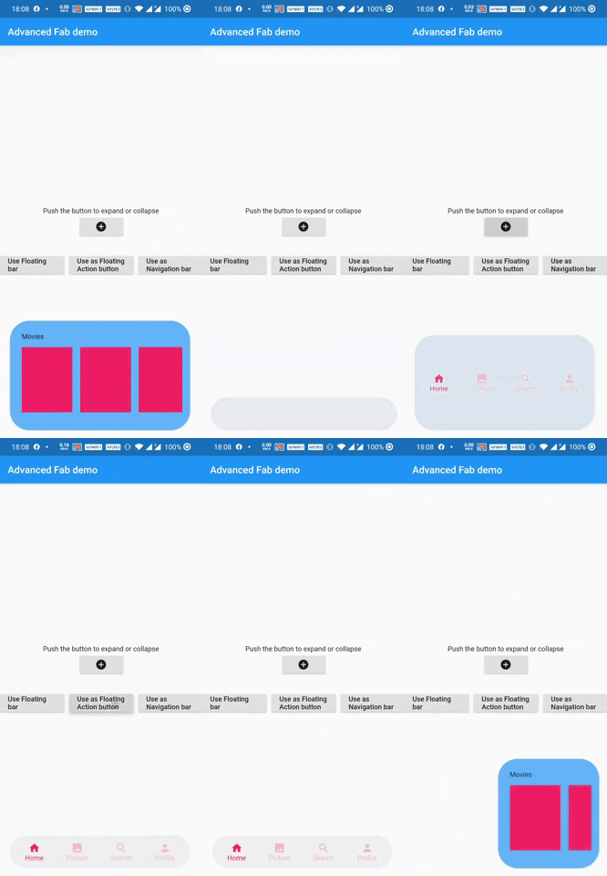
AdvFAB is An Advanced floating action button that expands itself to reveal its hidden widget. It can also be used as an AnimatedbottomNavigationbar or just an AnimatedFloatingActionBar with the same expansion capabilities. Have a look at the gif below
| Image 1 | Image 2 |
|---|---|
 |
 |
NOTE: This package has lots of functionalities and parameters to customize your AdvFab please refer to the example floder and the full documentation in order to take advantage of this package to the fullest. Use this quick guide to setup your work environment and understand the basics :)
- First import the package inside your project
import 'package:adv_fab/adv_fab.dart';
- In your project, create a AdvFabController
AdvFabController controller;
//now inside the inti function
@override
  void initState() {
    super.initState();
    controller = AdvFabController();
  }
This controller will allow you to expand, collapse and more importantly "setExpandedWidgetConfiguration". It will also give you the state of the AdvFab( true or false depending on whether the widget is expanded or not)
IMPORTANT : The "setExpandedWidgetConfiguration" shall be called at least once in the life time of your widget, to configure what has to be displayed once the AdvFab is expanded else you will get an error.
- Create an AdvFab widget inside the floatingActionButton of the scaffold
Scaffold(
	floatingActionButton: AdvFab(
		//controller shall not be null (actually it can but still....)
		controller: controller
	),
)
AdvFab allows you to create a navigation bar, an empty bar (where you can add a ny widget you want) or just a normal floating action button. To enable these functionalities, here are the flags to toggle
- useAsFloatingSpaceBar: false (by default )
- useAsFloatingActionButton: true ( by default )
- useAsNavigationBar: false (by default )
IMPORTANT : There can be only one value as "true", if you set more than one value as true, then a priority rule will be applied and will set the flag with higher priority to true and you will get a configuration error warning
- In order to maintain the screen adaptability of this widget (to make it look even on all screens), I opted for a formula based on percentages of the screen. This means that every width and height shall be given by you in the range [0 - 100],100 inclusive. Example:
AdvFab(
   useFloatingSpaceBar: true,
   floatingSpaceBarContainerWidth: 90,
),
-
To help you debug your code easily, I included a log facility, You just have to set the
ShowLogsproperty to true and you will get all of them. -
When you use AdvFab as a floating Action Button, the default Icon displayed will be a warning icon in red, just use the
floatingActionButtonIconColorandfloatingActionButtonIconproperties to change them; The floating action button also has its idenpendent ontap property calledonFloatingActionButtonTapped -
To use the AnimatedBottomNavigationBar, the body of the scaffold shall be a
AdvBottomBarBody
Thank you for using my package, if you have any question feel free to contact me on instagram or directly on my mail [email protected]
Here are my other packages
- Ultimate Data Generator: generate realistic datas
- Sliding Card: Animated card that slides down to reveal its hidden part