Flutter for web is a framework that allows you to build web applications using the Dart programming language and the Flutter framework. Flutter, originally designed for mobile app development, was extended to support web development starting from version 2.0. It enables developers to create high-performance, cross-platform web applications with a single codebase.
There are many great web frameworks available but flutter for web platform has its own unique advantages over other web frameworks. They are as follows
- Less development time & cost due to code reusability.
- Better team management (Same team can work on flutter for web) .
- Similar look and feel in both mobile and web platforms.
- Large numbers of flutter web libraries already available.
- Constantly performance improvements are being made by flutter team.
- Great community support.
The below instructions covers setting up your new/existing project for web support.
- Latest Flutter SDK
- If you don't have one follow installation instructions from here.
- if you already have Flutter SDK installed make sure you have the latest one. For updating run the below commands.
$ flutter channel stable
$ flutter upgrade
- IDE (Optional)
- IDE that supports Flutter. You can install VS Code or Android Studio.
You can run the below command for creating your app with web support.
$ flutter create my_app
$ cd my_appYou can run the below command for adding web support in your existing flutter app.
$ flutter create --platforms=web .For running your newly created app in your browser. You can run the below command.
$ flutter run -d chromeThe most commonly faced navigation problems when enabling web support in your flutter app are as follow.
- How to handle web url changes when user navigates to new screen.
- How to handle navigation when user presses back/forward button.
- How to handle web url changes when user changes it from address bar.
- How to pass data as query parameters from one screen to another.
- How to handle sharable link in your app.
Let's start with the coding part and explore all the above issues one by one.
For handling navigation part in our app we will be using popular go_router package.
Let start by including it in our pubspec.yaml file.
dependencies:
go_router: ^7.1.1Now lets create our app it will contain 3 screens.
- Home Screen (which contains list of profiles available).
- Profile Screen (display a single selected profile).
- 404 Screen (display 404 not found message when web path is invalid) .
Now lets create our MaterialApp using router and declare all the screens present in the app.
class MyApp extends StatelessWidget {
  const MyApp({super.key});

  @override
  Widget build(BuildContext context) {
    return MaterialApp.router(
      theme: ThemeData(
        colorScheme: ColorScheme.fromSeed(seedColor: Colors.deepPurple),
        useMaterial3: true,
      ),
      routerConfig: GoRouter(
        routes: [ // Declare all the screens here
          GoRoute(
            path: '/', // Web path to home screen
            builder: (context, state) => const HomeScreen(),
          ),
          GoRoute(
            path: '/profile/:id', // Web path to profile screen with some argument as id to display profile
            builder: (context, state) => ProfileScreen(id: state.pathParameters['id']),
          ),
        ],
        errorBuilder: (context, state) => const NotFoundScreen(), // For handling invalid url paths
      ),
    );
  }
}
Here we have created a MaterialApp with 3 screens which can be accessible using following web paths.
- '/': For home screen.
- '/profile/:id': For profile screen.
- Not found screen for invalid paths.
Now let's create our HomeScreen which will display list of profiles available and by clicking on one profile user can navigate to profile screen .
// Profile Model
class Profile {
  final String id;
  final String name;
  final String email;

  const Profile({
    required this.id,
    required this.name,
    required this.email,
  });
}

const List<Profile> availableProfiles = [
  Profile(id: '1', name: 'Dipak', email: '[email protected]'),
  Profile(id: '2', name: 'Nikhil', email: '[email protected]'),
  Profile(id: '3', name: 'Rohan', email: '[email protected]'),
];

class HomeScreen extends StatelessWidget {
  const HomeScreen({super.key});

  // Here we are navigating the user to selected profile and also updating the web url in address bar
  void _navigateToProfile(BuildContext context, Profile profile) {
    context.go('/profile/${profile.id}');
  }

  @override
  Widget build(BuildContext context) {
    return Scaffold(
      appBar: AppBar(
        backgroundColor: Theme.of(context).colorScheme.inversePrimary,
        title: const Text('Profiles'),
      ),
      body: ListView.builder(
        itemCount: availableProfiles.length,
        itemBuilder: (context, index) {
          final Profile profile = availableProfiles[index];
          return _tileItem(context, profile);
        },
      ),
    );
  }

  Widget _tileItem(BuildContext context, Profile profile) {
    return ListTile(
      onTap: () => _navigateToProfile(context, profile),
      leading: Container(
        padding: const EdgeInsets.all(12.0),
        decoration: BoxDecoration(
          color: Theme.of(context).colorScheme.primary.withOpacity(0.5),
          shape: BoxShape.circle,
        ),
        child: Text(
          '#${profile.id}',
          style: const TextStyle(color: Colors.white, fontSize: 12),
        ),
      ),
      title: Text(profile.name),
      subtitle: Text(profile.email),
    );
  }
}
Here we have created a model class for profile that contains profile id, name & email. Then we have created a static global list of available profiles that contains 3 items.
And at last we have created a home screen that shows a list of available profiles and by clicking on one we navigate the user to the profile screen.
Here you can see how are we passing the profile id as argument to the profile screen.
 // As we declared profile screen path in MaterialApp
 // The :id should be replaced by actual value
'/profile/:id' -> '/profile/1'

 // Here the full code for navigating using profile id
 void _navigateToProfile(BuildContext context, Profile profile) {
   context.go('/profile/${profile.id}');
}Now let's create our Profile which will display profile by taking profile id from web url (as query parameters).
class ProfileScreen extends StatefulWidget {
  final String? id;

  const ProfileScreen({Key? key, this.id}) : super(key: key);

  @override
  State<ProfileScreen> createState() => _ProfileScreenState();
}

class _ProfileScreenState extends State<ProfileScreen> {
  Profile? profile;

  @override
  void initState() {
    _loadProfile();
    super.initState();
  }

  // Here we are calling loadProfile() again when widget configuration changes like id passed to this widget has been changed
  @override
  void didUpdateWidget(covariant ProfileScreen oldWidget) {
    _loadProfile();
    super.didUpdateWidget(oldWidget);
  }

  void _loadProfile() {
    try {
      profile = null;
      profile = availableProfiles.firstWhere((e) => e.id == widget.id);
    } catch (_) {}
  }

  void _handleBack() {
    if (context.canPop()) {
      context.pop();
    } else {
      context.pushReplacement('/');
    }
  }

  @override
  Widget build(BuildContext context) {
    if (profile == null) {
      return const NotFoundScreen();
    }

    return Scaffold(
      appBar: AppBar(
        backgroundColor: Theme.of(context).colorScheme.inversePrimary,
        leading: IconButton(
          onPressed: _handleBack,
          icon: const Icon(Icons.arrow_back),
        ),
        title: const Text('Profile'),
      ),
      body: Center(
        child: Column(
          mainAxisSize: MainAxisSize.min,
          crossAxisAlignment: CrossAxisAlignment.start,
          children: [
            Text('ID: ${profile!.id}'),
            Text('Name: ${profile!.name}'),
            Text('Email: ${profile!.email}'),
          ],
        ),
      ),
    );
  }
}
Here we are using the id passed from the parent widget and displaying the profile.
Here we have also override the didWidgetUpdate() to handle any changes done to the id argument. Like user changes id value from browser address bar or something like that.
And we have also handle 404 not found scenario when id does not match with any item in available profiles.
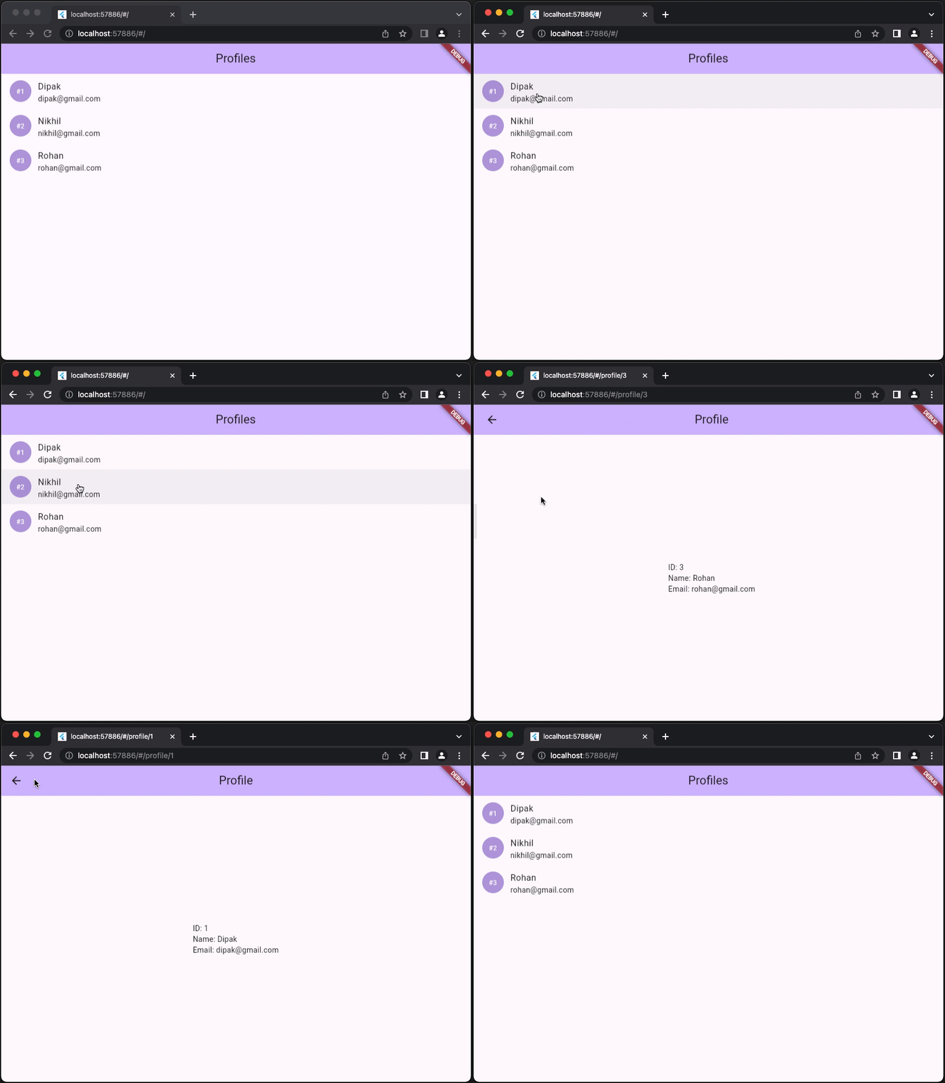
Here you can see when navigating from inside the app the web address gets changed. i.e '/' (Home page path) changes to '/profile/1' and vice versa.
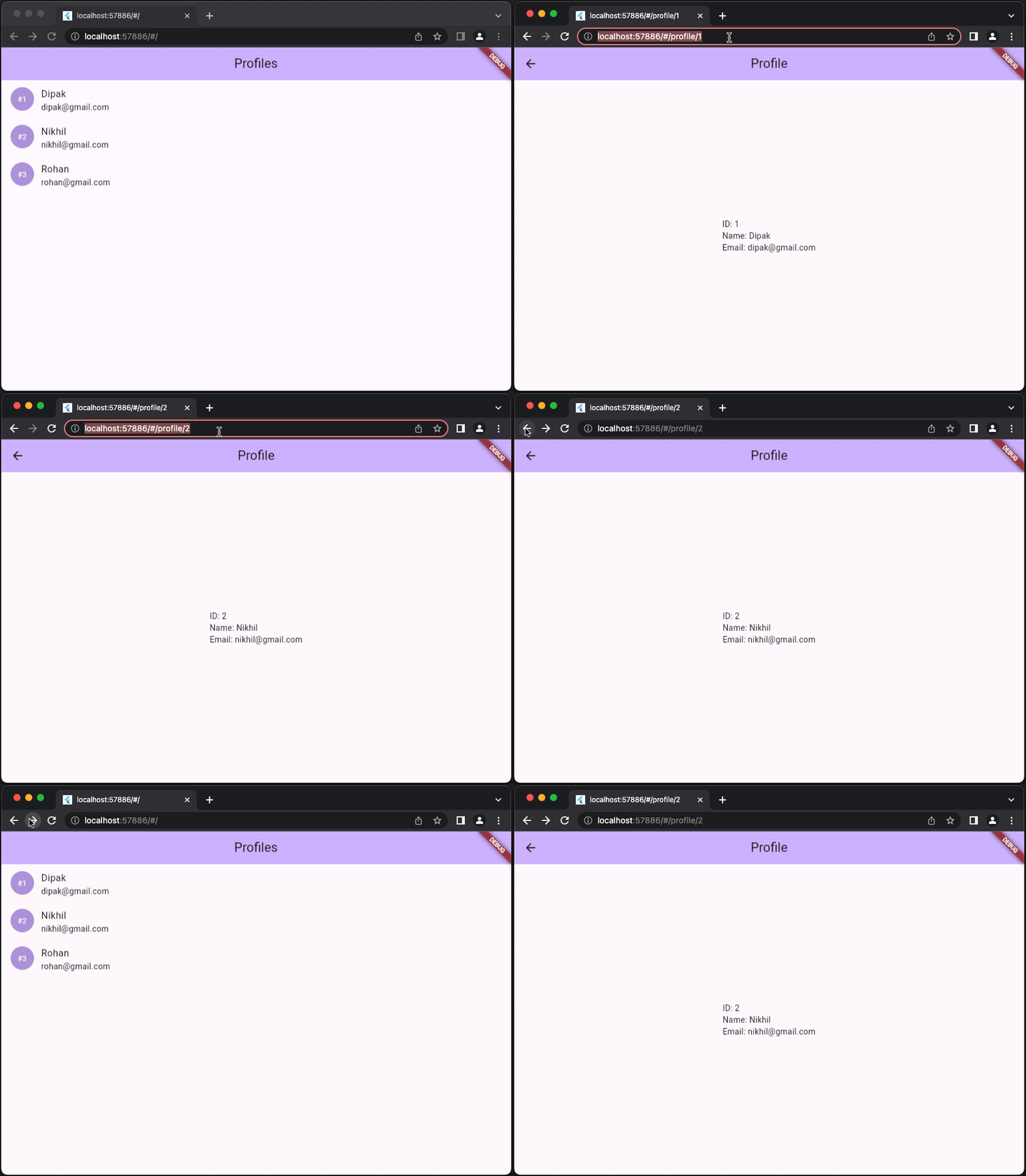
Here you can see that when changing profile id from address bar the profile data on the screen gets changed and user can also navigate using back/forward buttons.
When developing a flutter web app, one main aspect to consider is responsiveness as your web app will be accessible for mobile, tablet or desktop. Responsive design ensures that your app adapts and looks great on various devices with different screen sizes, orientations, and resolutions.
Let's start with the coding part
Now lets create our app it will contain only one screen (Home Screen).
- A mobile view with bottom navigation
- A tablet view with a navigation drawer
- A desktop view with a permanent navigation drawer on left side.
Now lets create our MaterialApp.
class MyApp extends StatelessWidget {
  const MyApp({super.key});

  @override
  Widget build(BuildContext context) {
    return MaterialApp(
      theme: ThemeData(
        colorScheme: ColorScheme.fromSeed(seedColor: Colors.deepPurple),
        useMaterial3: true,
      ),
      home: const DashboardScreen(),
    );
  }
}
Before we start with the dashboard screen let's first create a utility widget (ResponsiveBuilder) that will help us to make your app responsive
class ResponsiveBuilder extends StatelessWidget {
  final Widget phone;
  final Widget tablet;
  final Widget desktop;

  static const double _phoneSize = 576;
  static const double _tabletSize = 768;
  static const double _desktopSize = 1200;

  static bool isPhone(double width) => width < _tabletSize;
  static bool isTablet(double width) => width >= _tabletSize && width < _desktopSize;
  static bool isDesktop(double width) => width >= _desktopSize;

  const ResponsiveBuilder({
    Key? key,
    this.phone = const SizedBox.shrink(),
    this.tablet = const SizedBox.shrink(),
    this.desktop = const SizedBox.shrink(),
  }) : super(key: key);

  @override
  Widget build(BuildContext context) {
    double width = MediaQuery.of(context).size.width;

    if (width >= _desktopSize) {
      return desktop;
    } else if (width >= _tabletSize) {
      return tablet;
    } else {
      return phone;
    }
  }
}
As you can see ResponsiveBuilder takes 3 arguments phone, tablet & desktop. This 3 arguments are widget that will be render on the screen based on the screen size available.
For example
- If width >= 1200, Desktop widget will be render on the screen
- if width < 576, Phone widget will be render on the screen
- else Tablet widget will be render
Now let's create our dashboard screen which will have 3 tabs (Home, Discover & Profile) and will have different navigation bar based on screen size.
class DashboardScreen extends StatefulWidget {
  const DashboardScreen({super.key});

  @override
  State<DashboardScreen> createState() => _DashboardScreenState();
}

class _DashboardScreenState extends State<DashboardScreen> with TickerProviderStateMixin {
  late final TabController _tabController;
  int _selectedTabIndex = 0;

  final List<IconData> _icons = const [
    Icons.home,
    Icons.business,
    Icons.person,
  ];

  final List<String> _labels = const [
    'Home',
    'Discover',
    'Profile',
  ];

  void _changeTab(int index) {
    setState(() {
      _selectedTabIndex = index;
      _tabController.index = index;
    });
  }

  @override
  void initState() {
    super.initState();
    _tabController = TabController(initialIndex: _selectedTabIndex, length: _labels.length, vsync: this);
  }

  @override
  Widget build(BuildContext context) {
    double width = MediaQuery.of(context).size.width;

    return Row(
      children: [
        DesktopNavigationBar(
          selectedTabIndex: _selectedTabIndex,
          icons: _icons,
          labels: _labels,
          onSelectionChanged: _changeTab,
        ),
        Expanded(
          child: Scaffold(
            drawer: ResponsiveBuilder.isTablet(width)
                ? TabletNavigationBar(
                    selectedTabIndex: _selectedTabIndex,
                    icons: _icons,
                    labels: _labels,
                    onSelectionChanged: _changeTab,
                  )
                : null,
            appBar: AppBar(
              backgroundColor: Theme.of(context).colorScheme.inversePrimary,
              title: Text(_labels[_selectedTabIndex]),
            ),
            body:  TabBarView(
              controller: _tabController,
              children: const [
                HomeScreen(),
                DiscoverScreen(),
                ProfileScreen(),
              ],
            ),
            bottomNavigationBar: PhoneNavigationBar(
              selectedTabIndex: _selectedTabIndex,
              icons: _icons,
              labels: _labels,
              onSelectionChanged: _changeTab,
            ),
          ),
        ),
      ],
    );
  }
}
Here you can see that we have used 3 types of DesktopNavigationBar, TabletNavigationBar & PhoneNavigationBar. These 3 navigation bars will not render all at once these all will render based on screen size available. Let's check what they do under the hood.
class PhoneNavigationBar extends StatelessWidget {
  final int selectedTabIndex;
  final List<IconData> icons;
  final List<String> labels;
  final void Function(int index)? onSelectionChanged;

  const PhoneNavigationBar({
    Key? key,
    required this.selectedTabIndex,
    required this.icons,
    required this.labels,
    this.onSelectionChanged,
  }) : super(key: key);

  @override
  Widget build(BuildContext context) {
    return ResponsiveBuilder(
      phone: BottomNavigationBar(
        currentIndex: selectedTabIndex,
        items: [
          for (int i = 0; i < labels.length; i++)
            BottomNavigationBarItem(
              icon: Icon(icons[i]),
              label: labels[i],
            ),
        ],
        onTap: onSelectionChanged,
      ),
    );
  }
}

class TabletNavigationBar extends StatelessWidget {
  final int selectedTabIndex;
  final List<IconData> icons;
  final List<String> labels;
  final void Function(int index)? onSelectionChanged;

  const TabletNavigationBar({
    Key? key,
    required this.selectedTabIndex,
    required this.icons,
    required this.labels,
    this.onSelectionChanged,
  }) : super(key: key);

  @override
  Widget build(BuildContext context) {
    return ResponsiveBuilder(
      tablet: _Drawer(
        selectedTabIndex: selectedTabIndex,
        icons: icons,
        labels: labels,
        onSelectionChanged: onSelectionChanged,
      ),
    );
  }
}

class DesktopNavigationBar extends StatelessWidget {
  final int selectedTabIndex;
  final List<IconData> icons;
  final List<String> labels;
  final void Function(int index)? onSelectionChanged;

  const DesktopNavigationBar({
    Key? key,
    required this.selectedTabIndex,
    required this.icons,
    required this.labels,
    this.onSelectionChanged,
  }) : super(key: key);

  @override
  Widget build(BuildContext context) {
    return ResponsiveBuilder(
      desktop: _Drawer(
        selectedTabIndex: selectedTabIndex,
        icons: icons,
        labels: labels,
        onSelectionChanged: onSelectionChanged,
      ),
    );
  }
}

class _Drawer extends StatelessWidget {
  final int selectedTabIndex;
  final List<IconData> icons;
  final List<String> labels;
  final void Function(int index)? onSelectionChanged;

  const _Drawer({
    Key? key,
    required this.selectedTabIndex,
    required this.icons,
    required this.labels,
    this.onSelectionChanged,
  }) : super(key: key);

  @override
  Widget build(BuildContext context) {
    return Drawer(
      shape: RoundedRectangleBorder(borderRadius: BorderRadius.circular(0)),
      child: Column(
        children: [
          Row(
            children: [
              Container(
                padding: const EdgeInsets.only(left: 16, top: 16.0, bottom: 36.0),
                child: const FlutterLogo(size: 48),
              ),
            ],
          ),
          for (int i = 0; i < labels.length; i++)
            ListTile(
              onTap: () => onSelectionChanged?.call(i),
              selected: i == selectedTabIndex,
              leading: Icon(icons[i]),
              title: Text(labels[i]),
            ),
        ],
      ),
    );
  }
}
Here you can see that we are using ResponsiveBuilder for different navigation bar based on screen size.
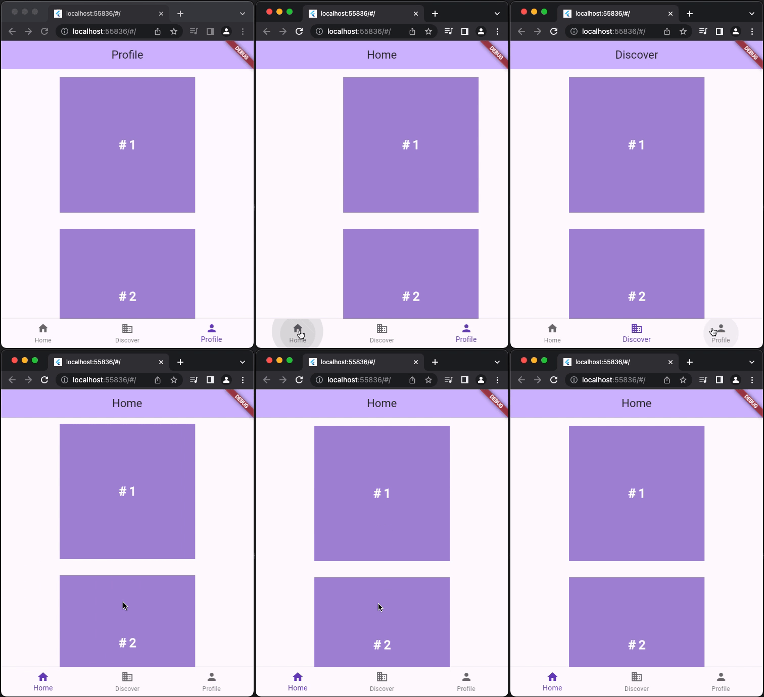
Here you can see when the screen size is small bottom navigation bar is shown
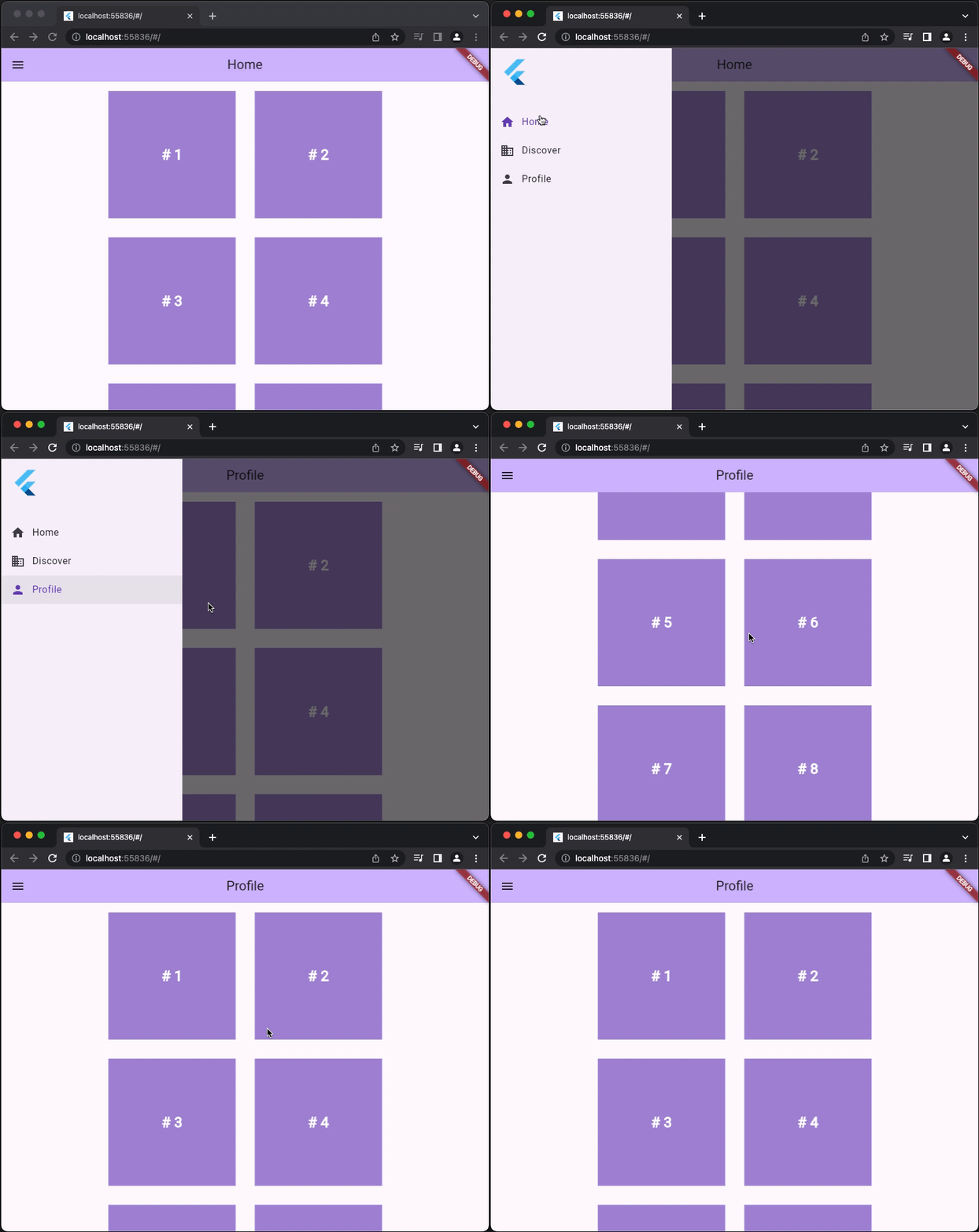
Here you can see when the screen size is medium navigation drawer is shown
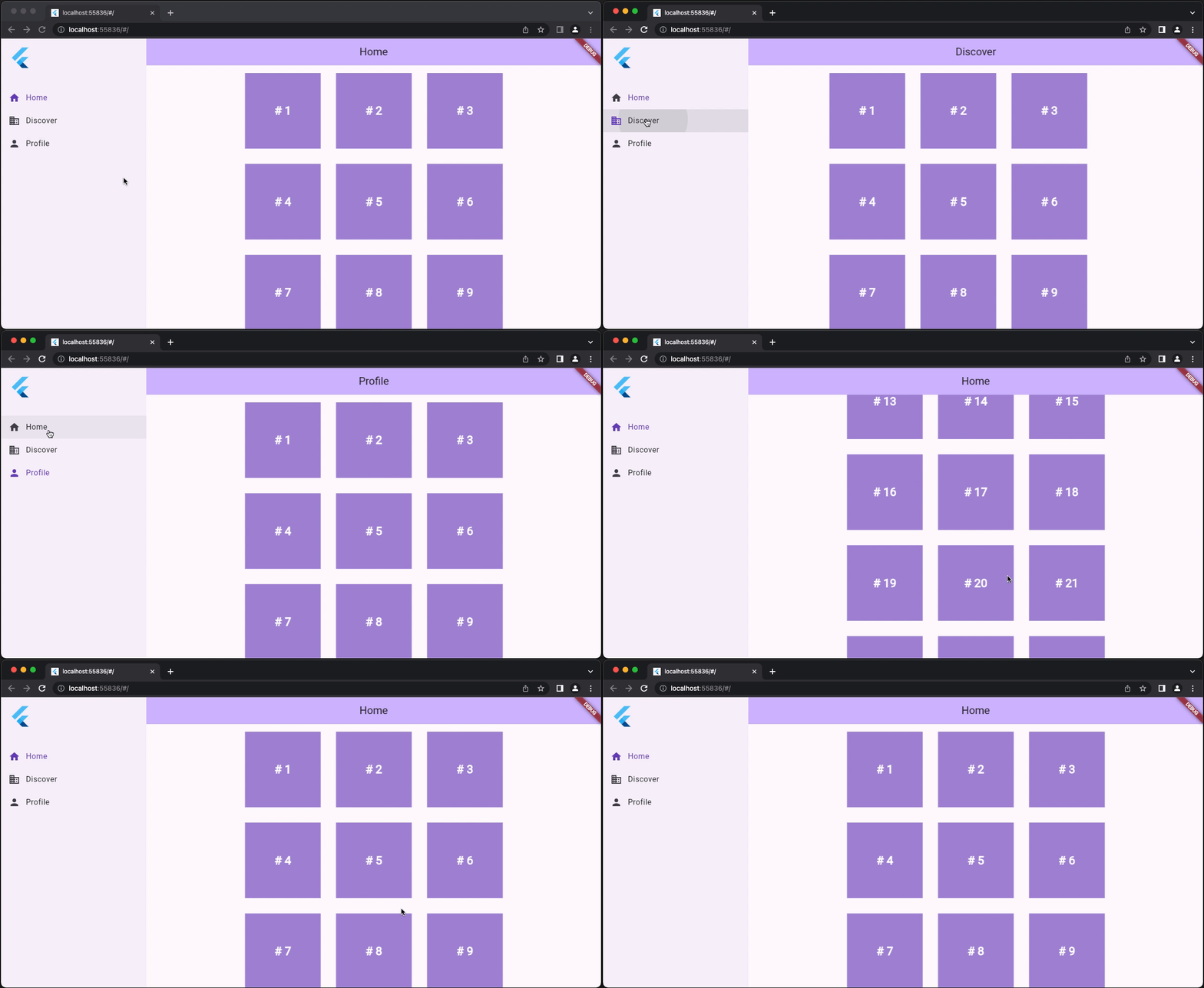
Here you can see when the screen size is large permanent navigation drawer is shown
In general, Flutter is geared towards dynamic application experiences. Flutter’s web support is no exception. Flutter web prioritizes performance, fidelity, and consistency. This means application output does not align with what search engines need to properly index. For web content that is static or document-like, we recommend using HTML—just like on flutter.dev, dart.dev, and pub.dev. You should also consider separating your primary application experience—created in Flutter—from your landing page, marketing content, and help content—created using search-engine optimized HTML.
