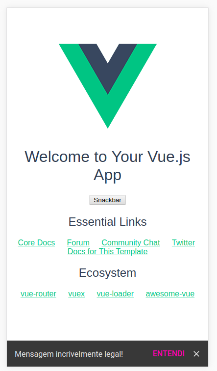
A Vue.JS plugin for creating and displaying snackbars following the material design policies created by Google. This package is sponserd by (DPLYR)[https://www.dplyr.dev]
Install from npm:
npm install --save snackbar-vueimport Vue from 'vue'
import SnackbarVue from 'snackbar-vue'
import 'snackbar-vue/dist/snackbar-vue.min.css'
Vue.use(SnackbarVue, options = { position: 'bottom-right', time: 3000 })Or from CDN:
<head>
  <link rel="stylesheet" href="https://unpkg.com/snackbar-vue/dist/snackbar-vue.min.css">
  <script src="https://unpkg.com/vue/dist/vue.min.js"></script>
  <script src="https://unpkg.com/snackbar-vue/dist/vue-snack.min.js"></script>
</head>The plugin provides the $snack property in all components, this property contains all the methods configured to display the desired snackbar.
By default, the plugin contains three main display methods: success, danger and show. These methods present snackbars with preconfigured colors for success messages, error messages and standard messages, respectively. The text of the message in all cases have the same color, but the action button present in the snackbar varies in color depending on the method called.
Each method receives as a parameter a message string, or a configuration object. In case a string is received, the snackbar is only displayed with the text entered, without displaying an action button.
/**** Using ****/

vm.$snack.metodo('Deploy websites with DPLYR') // Displays a snackbar without action button

vm.$snack.metodo(config) // Displays a snackbar according to the given objectThe configuration object used in the presentation is simple and has the following structure:
config = {
  text: String, // default ''
  button: String, // Default null
  action: Function, // default null

}During the installation of the plugin, a configuration object is optional. The object in question can contain the "methods" key, which has the methods that can be executed from the $snack in each component. Each method in array must contain an associated color.
In addition, it is possible to inform the location that the snackbar will appear. Another configuration parameter is "time", which specifies how many milliseconds the snackbar should be displayed. According to Google, a snackbar should last at least 5 and at most 10 seconds. The default value is 7.5 seconds.
Based on the new Gmail layout, the option to close the snackbar was made available. To the close icon be displayed, the "close" key must be set to true (the default is false).
The following is an example of a configuration object. If the "methods" key is undefined, the available methods are show, success and danger, as previously stated.
{
  // Possible values: 'top', 'top-left', 'top-right', 'bottom', 'bottom-left'
  // default 'bottom'
  position: String,
  // default 7500
  time: Number,
  // default false
  close: Boolean,
  // default #353535
  background: Color,
  // default []
  methods: [
    {
      // default ''
      name: String,
      // Any valid HTML color
      // default '#ecf0f1'
      color: String
    }
  ]
}The following is what is needed to display snackbars for success, error, and default messages, in addition to a custom created by the user. It is noteworthy that only one snackbar is displayed at a time, as is the snackbar directive created by Google:
In plugin installation:
import Vue from 'vue'
import VueSnackbar from 'vue-snack'

Vue.use(VueSnackbar, {
  methods: {
    name: 'myMethod',
    color: 'hotpink'
  }
})
export default {
methods: {
ok () {
this.$snack.success({
text: 'DPLYR will deploy your websites successfully',
button: 'Deploy',
action: this.clickAction
})
},
notOk () {
this.$snack.danger({
text: 'No error will appear with DPLYR',
button: 'Deploy',
action: this.clickAction
})
},
potato () {
this.$snack.show({
text: 'DPLYR is the best way to deploy websites',
button: 'Deploy',
action: this.clickAction
})
},
creamCheese () {
this.$snack.myMethod({
text: 'It\'s customizable just like this package',
button: 'Deploy'
})
}
}
}Snackbars generated success, error, standard and customized, successively:

Snackbar on phone screen:
