This app was made to demonstrate some of my development skills, projects, and the story behind me as an iOS Developer for the WWDC Scholarship
Unfortunately, I was not awarded a scholarship, because my submission was faulty and was not submitted with the correct account
See the full app in action-YouTube
I built my portfolio app in a little over two weeks of solid deveopment time using Swift 2.3 When I built my portfolio app, I concentrated on a few aspects of the app that I wanted to make spectacular. One of my biggest concentrations was with UI/UX and animations. Inside the app I put together many custom animations to transition the user from screen to screen. One big decision I made when starting the app was to populate all of the information in the app from json, so I would be able to easily change any info or add more sections/delete sections after the app was created, without touching the code at all. There are 3 json files that hold all of the content in the app.
This app was optimized for an iPhone 6s Plus with Force Touch
[See full video from this point] (https://youtu.be/zIekBuRtOuA?t=8s)
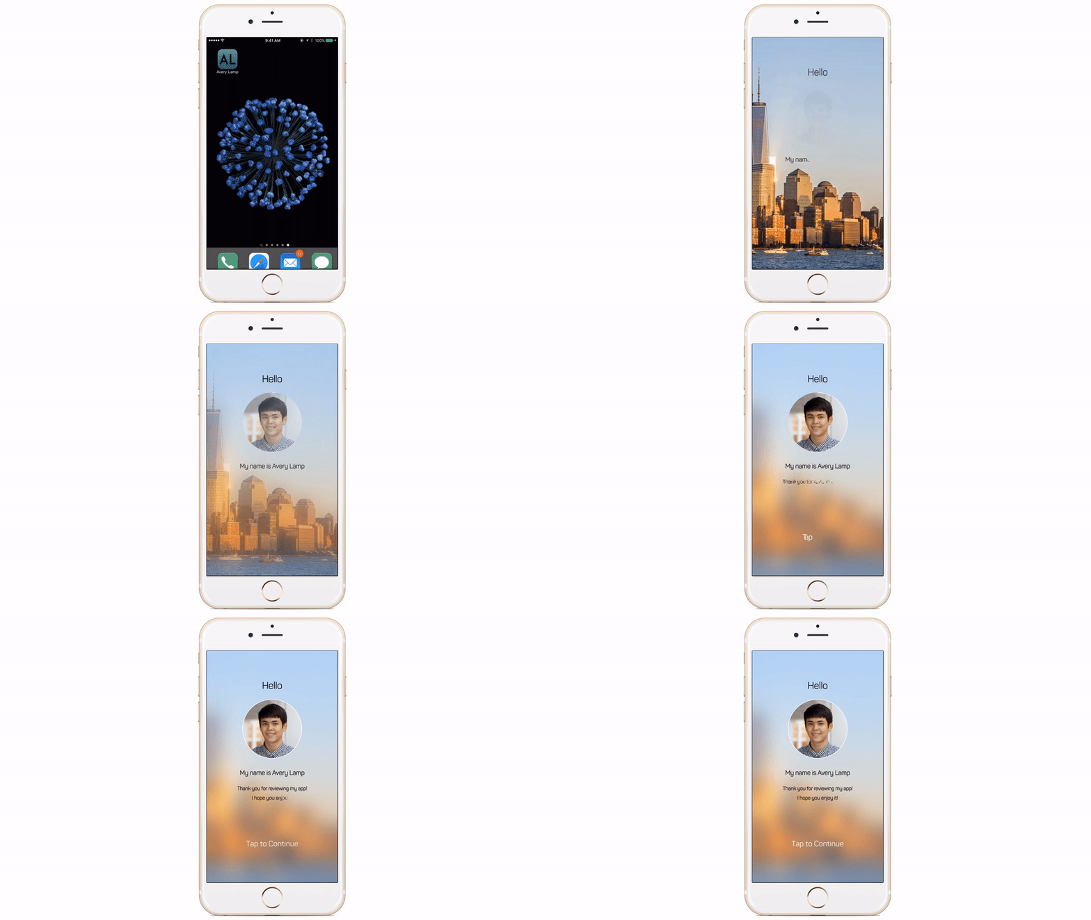
The first animation I use in the app is to tell the reviewer a little bit more about myself. While implementing this animation, I spent a lot of time tuning how the blur gradually appears in the backround. I had some difficulty making the blur keep the contrast that I wanted in the background picture, so to keep a lot of contrast I used multiple layers of images that fade in.
The text writing animation is probably my proudest animation that I came up with for the submission. In order to make this animation, I extended the UILabel class and read through a lot of old CoreText documentation. It was incredibly difficult to figure out how to get CGPaths from UILabels, but after a lot of research I was able to return individual character CAShapeLayers, or a single CAShapeLayer of the whole text path. Some of the biggest issues I had with the text animations were the CPU usage/memory of the CALayer animations. In order to reduce memory usage, I release the layers as soon as possible. I also had a strange error where the last line in a multiline animation sometimes does not animate properly.
In the future I hope to touch up the text animations and release it as a framework or my own custom ALLabel.
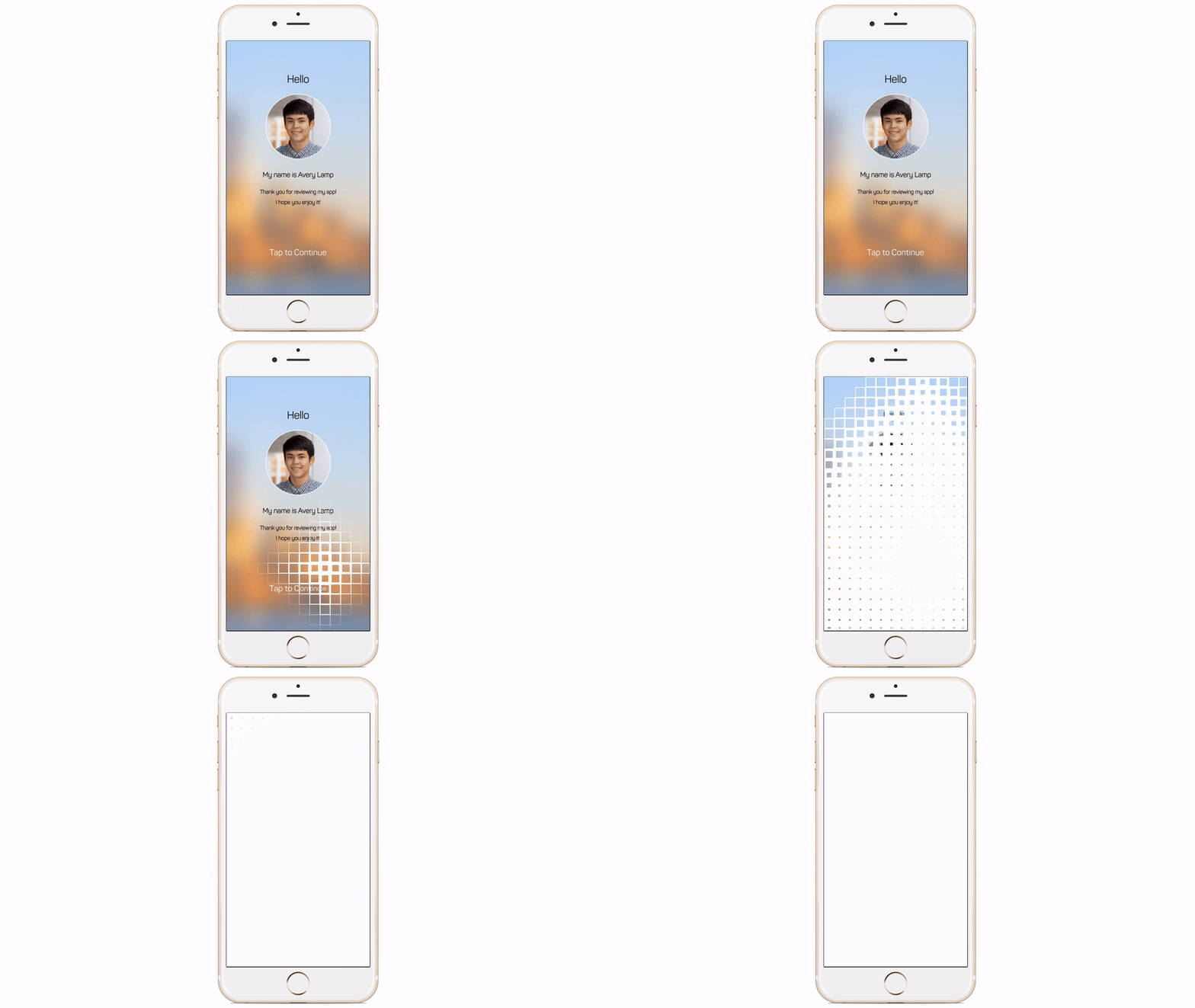
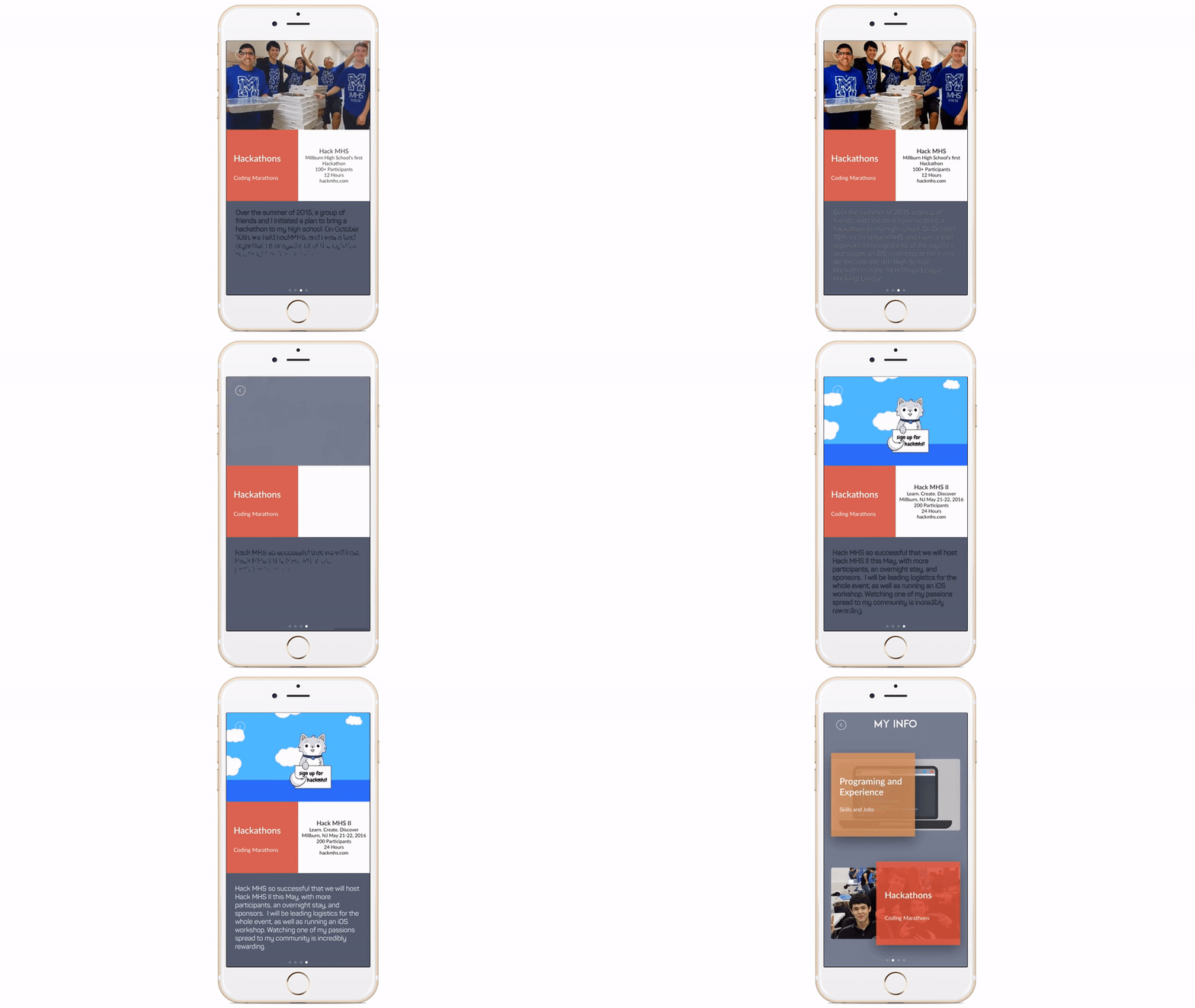
The box transition animation was one of my favorite animations that I created for the app. In order to accomplish the animation in code, when the user clicks an image of the current screen is stored. The image is spiced into a number of small boxes of variable height and width that are placed directly over the screen and stiched together to make the resulting image. Then I do a flood search from the location of the user's touch, scaling each box down individually and fading it to nothing.
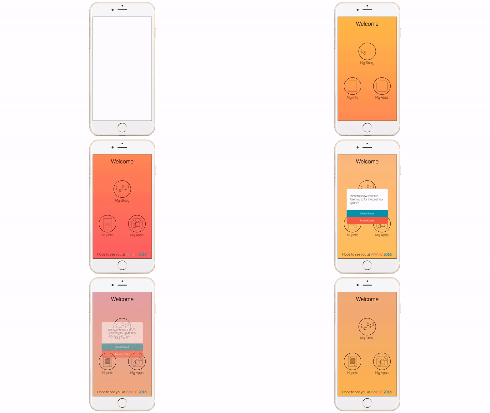
After the Info page fades out into the regular home page, I wanted to have a smooth transition to show the user where they could explore next. I created a couple icons in Sketch, then converted them into code through a lot of manipulations of CGPaths. All of the icons are drawn with frame math. It was a painstakingly long process to convert from mockup to live animation, but in the end it came out well. To display more information about each icon, a user can force click on the icon and a small info blurb appears.
A less noticable part of this page is the seething color-changing gradient background. I built functions to create gradients from two colors, and create the appearance of a moving gradient in the background. The colors of the gradient are randomized from a list of previously selected colors. It was an experiment to see how it looked, but in the end it turned out to be a subtle thing that I liked.
[See full video from this point] (https://youtu.be/zIekBuRtOuA?t=44s)
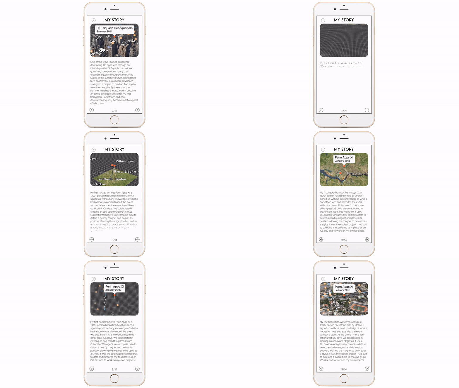
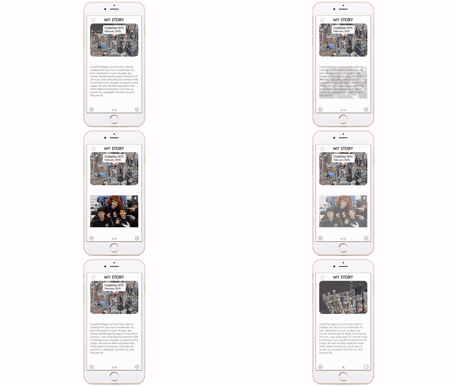
One of the coolest things that I built into the app from iOS 9 is the new flyover mode. In this mode I use MKMapKit to take the user through a journey of the milestones of my iOS Developer life. I added the Map animation in because I thought it was a nice touch to my story and development as an iOS developer.
Along with the map flyovers, I wanted to be able to add in caption images. Because of the limitation of space, I decided to make the detail text fade and unfade with the force of touch. When a user touches the text, depending on the force of the touch, the text will draw and undraw itself and reveal an image behind it. One of the biggest limitations I had with this type of animation was the CPU/memory of the phone. Each character is displayed as its own CAShapeLayer, and animated simultaneously. I decided to keep the effect, even though the text may not draw/undraw smoothly.
[See full video from this point] (https://youtu.be/zIekBuRtOuA?t=2m59s)
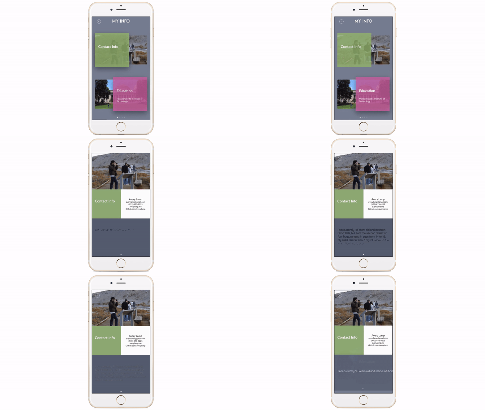
For my contact info, I decided it was best to put my life into sections with detail slides. I decided on a design inspired from Dribbble. In order to implement this animation from ViewController to DetailViewController I developed a custom AnimatedTransitioning class. The elements in the scroll view are all positioned with Autolayout and constraints, which made the animation particularly difficult to pull off. In order to do the transition animation, I ended up storing the info element constraints, giving it new constraints, then restoring the info element's constraints to its original. (Note: After conversion to Swift 3, this animation appears to be slightly broken (I'll try to fix it soon))
I tried to make the transition from detail text, to detail text smooth, with fading and redrawing of text elements.
[See full video from this point] (https://youtu.be/zIekBuRtOuA?t=3m50s)
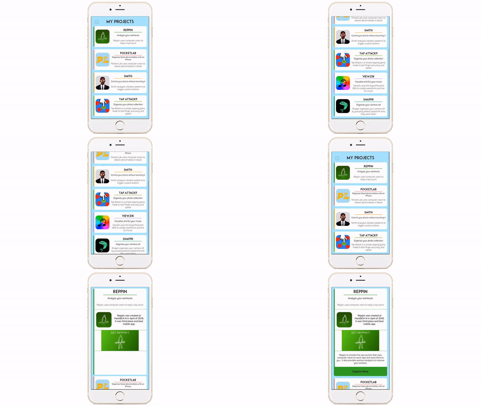
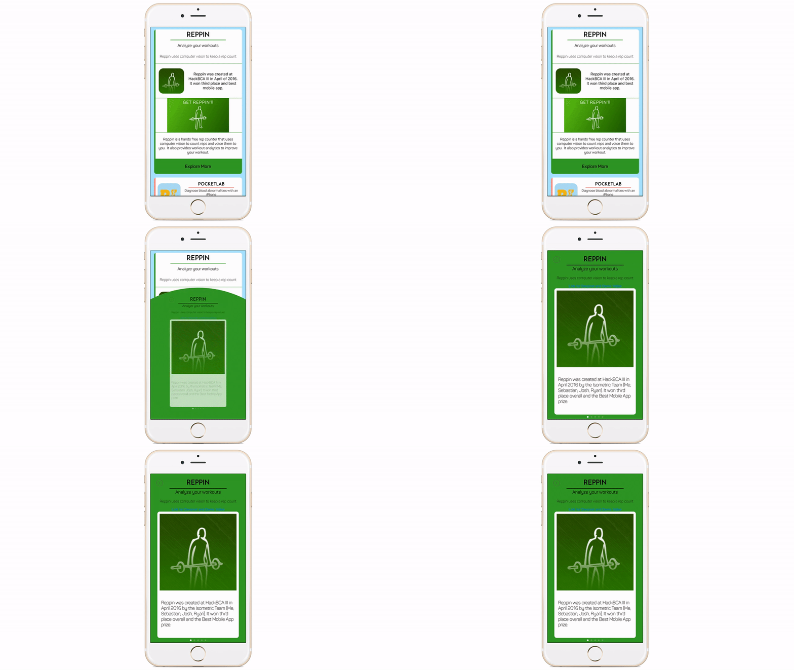
In order to keep the list of apps that I've made short, I decided to expand items on click. This was one of the more fun animations to make, with each detail section expanding to show more detail information on the app. I actually created two versions of this animation, one for the iPhone 5 screen size and another for the iphone 6/6+ screen size. Later I decided to optimize the whole app for the iPhone 6+ Screen size.
After an app detail was displayed, the user can click on the app to get even more information. I accomplished this transition with a bubble that expands from the center of the button, with the detail elements on that new page. The new page has detail items to scroll through, and a link to an external website (Devpost/Youtube) for an extended video/writeup.
All in all, this app has been a great experience to make, although I was not awarded a WWDC Scholarship.
If you would like to see more things that I have made, check out my:
If you would like to get in contact with me, here is my resume
