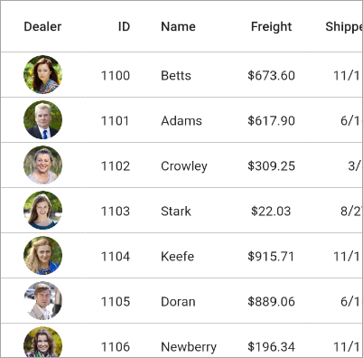
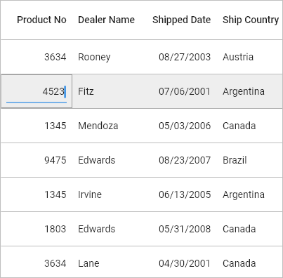
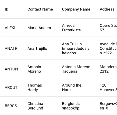
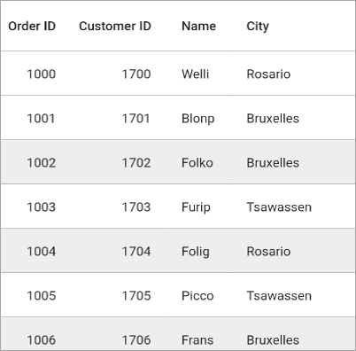
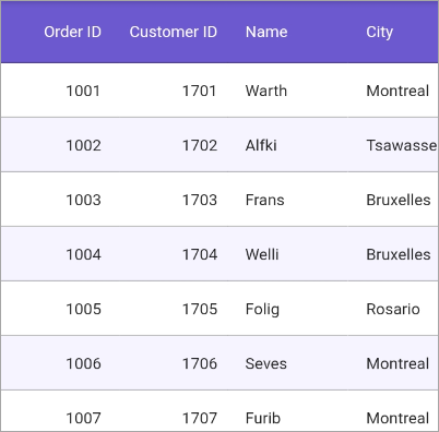
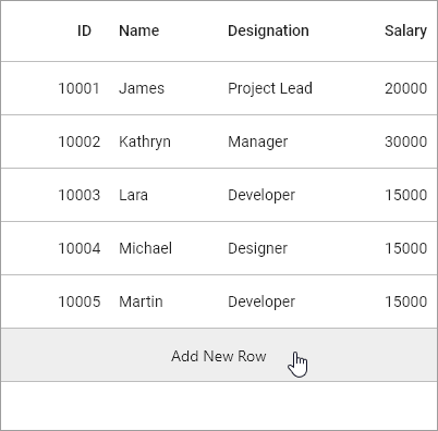
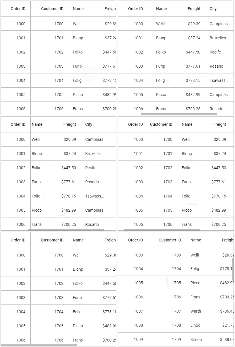
The Flutter DataTable or DataGrid is used to display and manipulate data in a tabular view. It is built from the ground up to achieve the best possible performance, even when loading large amounts data.
Disclaimer: This is a commercial package. To use this package, you need to have either a Syncfusion commercial license or Free Syncfusion Community license. For more details, please check the LICENSE file.
- DataGrid features
- Get the demo application
- Useful links
- Installation
- Getting started
- Support and feedback
- About Syncfusion
Column types - Support to load any widget in a each column.
Editing - Allows users to edit cell values. An editor widget can be loaded based on the column type to edit cell values.
Column sizing - Set the width of columns with various sizing options. Fit the columns based on the value of the cells to improve readability.
Row height - Set the height for header and data rows. Fit the rows based on the value of the cells to improve readability. Also, set the different height for specific rows.
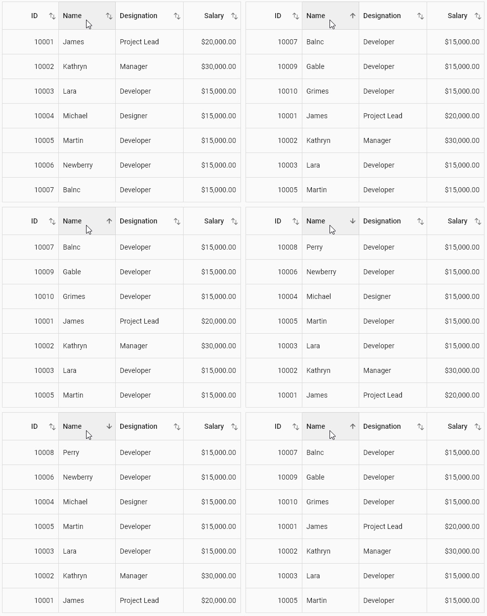
Sorting - Sort one or more columns in the ascending or descending order.
Selection - Select one or more rows. Keyboard navigation is supported for web platforms. Built-in checkbox columns allow display of a checkbox in each row to select entire rows when the boxes are checked. Users can also select or deselect all the rows by selecting the checkbox in the header.
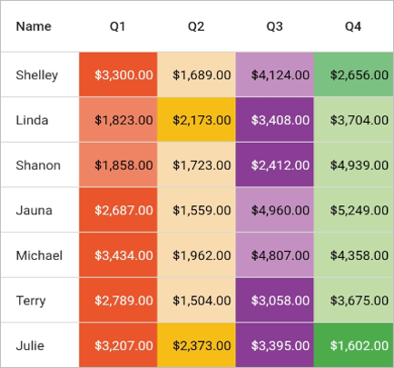
Styling - Customize the appearance of cells and headers. Conditional styling is also supported.
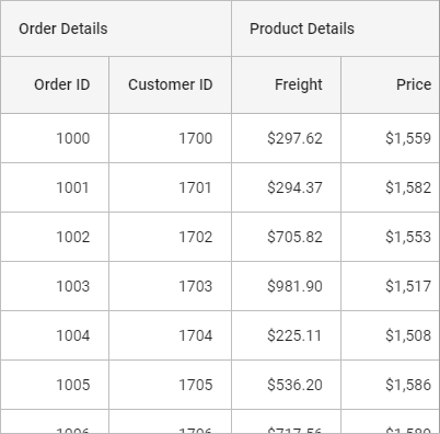
Stacked headers - Show unbound header rows. Unbound header rows span stacked header columns across multiple rows and columns.
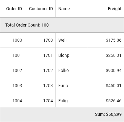
Summary row - Show an additional unbound row to display a summary or totals. Users can display a minimum, maximum, average, and count in columns.
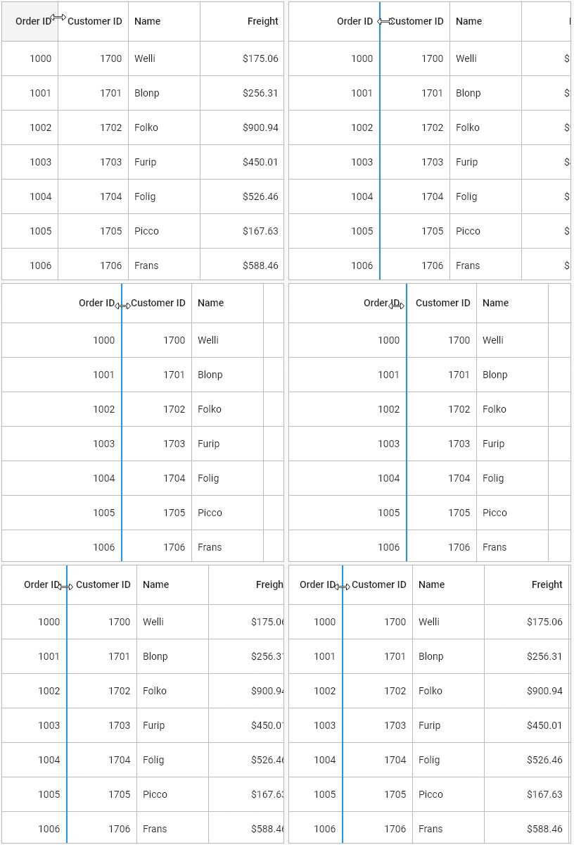
Column resizing - Resize the columns by tapping and dragging the right border of the column header.
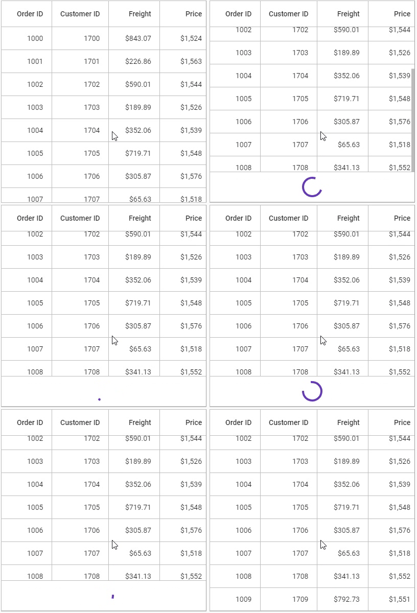
Load more - Display an interactive view when the grid reaches its maximum offset while scrolling down.
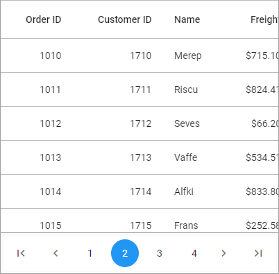
Paging - Load data in segments. It is useful when loading huge amounts of data.
Footer - Show an additional row that can be displayed below to last row. Widgets can also be displayed in the footer row.
Freeze Panes - Freeze the rows and columns when scrolling the grid.
Grouping - Allows users to organize and categorize data based on specific criteria, facilitating efficient interaction with summarized information.
Column drag and drop - Interactively customize the arrangement of columns by dragging and dropping them, enhancing user flexibility and personalization in organizing and viewing data.
Swiping - Swipe a row right to left or left to right for custom actions such as deleting, editing, and so on. When the user swipes a row, the row will be moved and the swipe view will show the custom actions.
Pull to refresh - Allows users to refresh data when the DataGrid is pulled down.
Exporting - Export the DataGrid content, such as rows, stacked header rows, and table summary rows, to Excel and PDF format with several customization options.
Theme - Use a dark or light theme.
Accessibility - The DataGrid can easily be accessed by screen readers.
Right to Left (RTL) - Right-to-left direction support for users working in RTL languages like Hebrew and Arabic.
Explore the full capabilities of our Flutter widgets on your device by installing our sample browser applications from the following app stores, and view sample code in GitHub.
Check out the following resource to learn more about the Syncfusion Flutter DataGrid:
Install the latest version from pub.
Import the following package.
import 'package:syncfusion_flutter_datagrid/datagrid.dart';The SfDataGrid is dependent upon data. Create a simple data source for SfDataGrid as shown in the following code example.
class Employee {
  Employee(this.id, this.name, this.designation, this.salary);
  final int id;
  final String name;
  final String designation;
  final int salary;
}
Create the collection of employee data with the required number of data objects. Here, the method used to populate the data objects is initialized in initState()
DataGridSource objects are expected to be long-lived, not re-created with each build.
List<Employee> employees = <Employee>[];

late EmployeeDataSource employeeDataSource;

@override
void initState() {
  super.initState();
  employees= getEmployees();
  employeeDataSource = EmployeeDataSource(employees: employees);
}

 List<Employee> getEmployees() {
  return[
  Employee(10001, 'James', 'Project Lead', 20000),
  Employee(10002, 'Kathryn', 'Manager', 30000),
  Employee(10003, 'Lara', 'Developer', 15000),
  Employee(10004, 'Michael', 'Designer', 15000),
  Employee(10005, 'Martin', 'Developer', 15000),
  Employee(10006, 'Newberry', 'Developer', 15000),
  Employee(10007, 'Balnc', 'Developer', 15000),
  Employee(10008, 'Perry', 'Developer', 15000),
  Employee(10009, 'Gable', 'Developer', 15000),
  Employee(10010, 'Grimes', 'Developer', 15000)
  ];
}DataGridSource is used to obtain the row data for the SfDataGrid. So, create the data source from the DataGridSource and override the following APIs in it:
-
rows: Fetches the rows available for data population. Also, it is used to fetch the corresponding data object to process the selection. This contains the collection ofDataGridRowwhere each row contains the collection ofDataGridCell. Each cell should have the cell value invalueproperty.valueis used to perform the sorting for columns. -
buildRow: Fetches the widget for each cell withDataGridRowAdapter.
class EmployeeDataSource extends DataGridSource {
  EmployeeDataSource({List<Employee> employees}) {
     _employees = employees
        .map<DataGridRow>((e) => DataGridRow(cells: [
              DataGridCell<int>(columnName: 'id', value: e.id),
              DataGridCell<String>(columnName: 'name', value: e.name),
              DataGridCell<String>(
                  columnName: 'designation', value: e.designation),
              DataGridCell<int>(columnName: 'salary', value: e.salary),
            ]))
        .toList();
  }

  List<DataGridRow>  _employees = [];

  @override
  List<DataGridRow> get rows =>  _employees;

  @override
  DataGridRowAdapter? buildRow(DataGridRow row) {
    return DataGridRowAdapter(
        cells: row.getCells().map<Widget>((dataGridCell) {
      return Container(
        alignment: (dataGridCell.columnName == 'id' || dataGridCell.columnName == 'salary')
            ? Alignment.centerRight
            : Alignment.centerLeft,
        padding: EdgeInsets.all(16.0),
        child: Text(dataGridCell.value.toString()),
      );
    }).toList());
  }
}
Create an instance of DataGridSource and set this object to the source property of SfDataGrid.
@override
Widget build(BuildContext context) {
  return Scaffold(
      appBar: AppBar(
        title: Text('Syncfusion DataGrid'),
      ),
      body: Center(
        child: Expanded(
          child: SfDataGrid(
            source: _employeeDataSource,
          ),
        ),
      ));
}SfDataGrid supports load any widget in columns. You can add the column collection to the columns property.
@override
Widget build(BuildContext context) {
  return Scaffold(
    appBar: AppBar(
      title: const Text('Syncfusion Flutter DataGrid'),
    ),
    body: SfDataGrid(
      source: employeeDataSource,
      columns: <GridColumn>[
        GridColumn(
            columnName: 'id',
            label: Container(
                padding: EdgeInsets.all(16.0),
                alignment: Alignment.centerRight,
                child: Text(
                  'ID',
                ))),
        GridColumn(
            columnName: 'name',
            label: Container(
                padding: EdgeInsets.all(16.0),
                alignment: Alignment.centerLeft,
                child: Text('Name'))),
        GridColumn(
            columnName: 'designation',
            width: 120,
            label: Container(
                padding: EdgeInsets.all(16.0),
                alignment: Alignment.centerLeft,
                child: Text('Designation'))),
        GridColumn(
            columnName: 'salary',
            label: Container(
                padding: EdgeInsets.all(16.0),
                alignment: Alignment.centerRight,
                child: Text('Salary'))),
      ],
    ),
  );
}
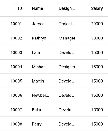
The following screenshot illustrates the result of the above code sample.
- If you have any questions, you can reach the Syncfusion support team or post queries to the community forums. You can also submit a feature request or a bug report through our feedback portal.
- To renew your subscription, click renew or contact our sales team at [email protected] | Toll Free: 1-888-9 DOTNET.
Founded in 2001 and headquartered in Research Triangle Park, N.C., Syncfusion has more than 20,000 customers and more than 1 million users, including large financial institutions, Fortune 500 companies, and global IT consultancies.
Today we provide 1,600+ controls and frameworks for web (ASP.NET Core, ASP.NET MVC, ASP.NET WebForms, JavaScript, Angular, React, Vue, Flutter, and Blazor), mobile (.NET MAUI, Xamarin, Flutter, UWP, and JavaScript), and desktop development (Flutter, .NET MAUI, WinForms, WPF, UWP, and WinUI). We provide ready-to- deploy enterprise software for dashboards, reports, data integration, and big data processing. Many customers have saved millions in licensing fees by deploying our software.

